Pizza Hut Malaysia

Country
Malaysia
Services
Customer Data Platform
CRM & Retention
Industry
Quick Service Restaurants
Technology
Netcore
Pizza Hut Malaysia takes orders through its own app and website, and its loyalty programme carries a customer base in the millions. All of that customer data sat in Netcore, a customer data platform the brand was running before we arrived. Convx by Z21 was brought in for the layer above it: lifecycle strategy, segmentation, journey architecture and creative. The platform team owned the build, so we specified and they configured, with the client in a weekly working session alongside both.
The Challenges
1. Eight journeys were live and almost none were segmented: Most were never-ending sends to broadly everybody, the single on-site personalisation was returning a login error to real customers, and nobody could say which was earning anything.
2. Dormancy meant everything, so it meant nothing: Every customer who had stopped ordering sat in one segment, whether they had missed a single month or had not ordered in over a year, and they all got the same message and the same voucher.
3. Cart recovery had been built for retail: The journey waited days before following up, a sensible cadence for a considered purchase and the wrong one for dinner. By the time the first reminder arrived, the meal had been eaten.
4. The brand could reach far more people than it could recognise: Reminders went out to hundreds of thousands of anonymous profiles alongside known members, and no route on the website turned a browsing visitor into an identified one. Converting unknown customers into known ones was the client's own priority for the year.
Key Objectives
1. Segment Dormancy By Recency And By Value
2. Rebuild Cart Recovery On Food Timing
3. Give New Sign-Ups A Route To A First Order
4. Turn Anonymous Traffic Into Known Customers
The Solution
A customer data platform is worth exactly what the journeys built on top of it ask of the data.
1. Every live journey was audited before anything new was designed. That is how the broken personalisation and the retail cart cadence surfaced at all.
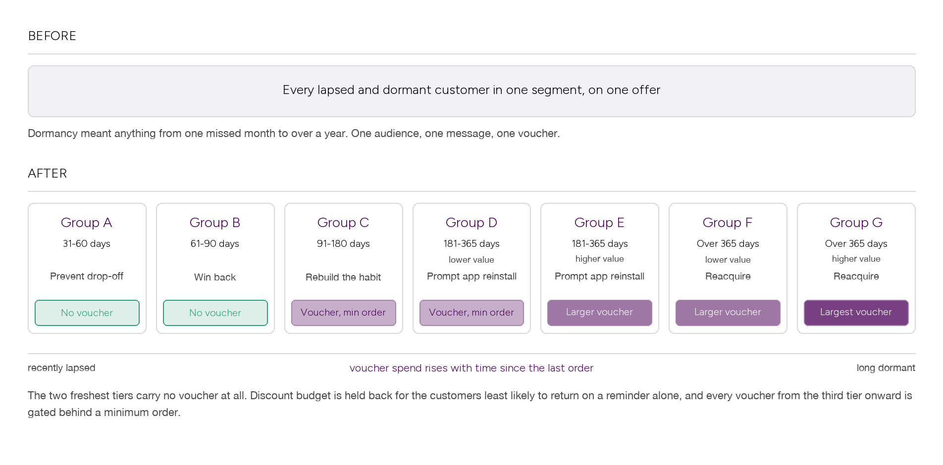
2. Segmentation was rebuilt on recency and value rather than a single dormancy flag. One segment became seven tiers, and the offer on each tier was decided separately from the message it carried.
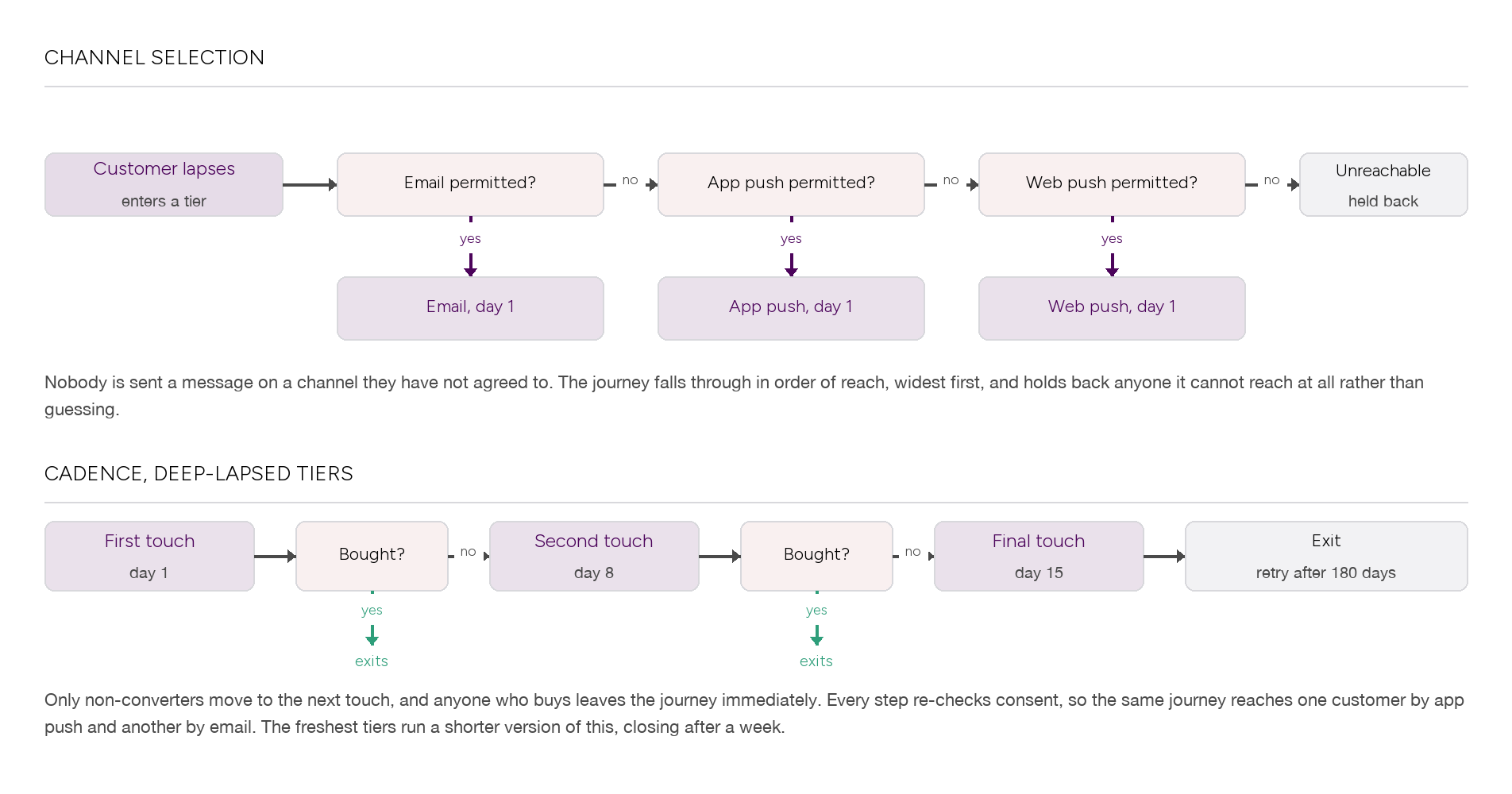
3. Consent became a targeting input rather than a compliance checkbox. Every journey branches on what each customer has actually permitted, so the same journey reaches one person by app push and another by email, and holds back anybody it cannot reach at all.
4. We designed to be built by somebody else. The platform team configured everything, so each journey had to be specified tightly enough to hand over without interpretation.
The Data Foundation
The segmentation work split the lapsed and dormant base by time since the last order, then split the two deepest bands again by customer value. One segment became seven tiers, and offer intensity was set per tier rather than per campaign.
The reachability audit changed more. Across the new sign-up cohort, email reached close to nine in ten, app push roughly a quarter, and web push almost nobody. It also inverted by behaviour, so customers who had reached a cart and customers who never had were reachable on opposite channels. A single channel plan would have been wrong for most of the base.
Journey 1: Seven Tiers From One Dormant Segment
The seven tiers run as separate journeys sharing one architecture: three touches, and an exit the moment somebody orders. The freshest tiers close after a week. The deepest run a fortnight, then release the customer for a re-attempt six months on.
The original plan put a voucher on every tier. The version that shipped took the voucher off the two freshest tiers completely, gated every remaining voucher behind a minimum order, and reserved the largest offers for customers who had not ordered in over a year.
Results:
the two tiers with no voucher drew the highest click-through of any tier
they also earned more between them than every voucher tier combined
the deepest low-value tiers earned almost nothing, on the largest vouchers in the programme
the one deep tier that did work was the higher-value one, not the higher-discount one
conversion was low everywhere, a handful of orders per ten thousand messages delivered
measured across the first seventeen days after launch
Recency and customer value predicted reactivation. Discount depth did not. The freshest tiers had drifted rather than left, so a reminder was enough on its own, and taking the voucher off them cost nothing. The deep low-value tiers had genuinely gone, and no offer we were willing to fund brought them back.
We should be straight that this contradicts the read we took at the time, which credited the voucher with the revenue. Going back to the export, the no-voucher tiers out-earned the voucher tiers. What the discount bought was reach into a segment that was not going to respond at any price, which is the most expensive kind of reach there is.
Journey 2: Cart Recovery Rebuilt On Food Timing
Food does not get reconsidered. Somebody who abandons a basket at dinner has either eaten within the hour or stopped being a customer that evening. The journey was rebuilt to fire inside the first half hour and to stop after a day. Anything older moves to a different journey, because a cart from yesterday is not a cart, it is a lapsed customer.
Channel order mattered more than we expected. App push carries a reminder that can still be acted on. Email arrives after the decision has been taken.
Results:
roughly nine in ten of all recovered cart revenue came through push rather than email
push click-through ran a little ahead of the journey it replaced
email still carried the later touches, for customers with no push consent
One caution, because this would be easy to overclaim. The previous and rebuilt journeys did not run as a clean split test: volumes were very uneven and the changeover was phased, so the revenue difference between them is not a measured result and we do not present it as one. The channel split is where the money actually arrived.
Journey 3: Onboarding, And The Customers We Could Not See
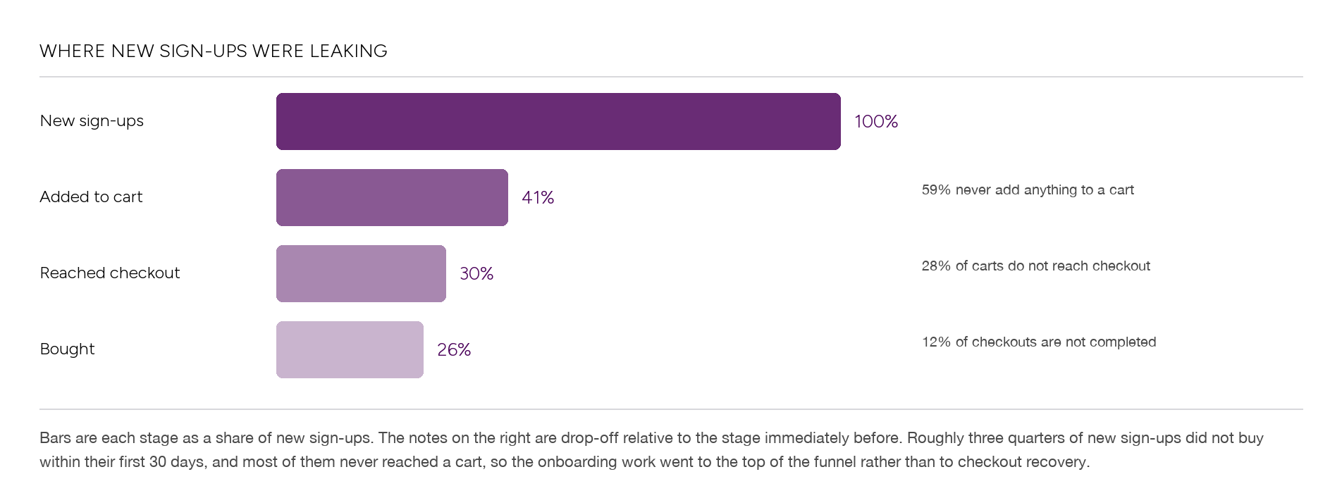
New sign-ups bought at just over a quarter within their first month, leaving roughly three quarters who never bought at all. The funnel showed where they went. Three in five never added anything to a cart. Checkout was not the problem. Getting a first choice made was the problem.
So the onboarding work went to the top of the funnel. A welcome sequence introduces the loyalty programme and the voucher pack that comes with signing up, explains how to use it, then reminds people before it expires. New sign-ups were also excluded from cart recovery, so nobody is chased by two journeys at once.
Alongside that, the loyalty reminders were rebuilt around expiry rather than promotions. Telling somebody that rewards they already own are about to disappear was the most dependable message in the programme.
And then the part that did not work.
Results:
anonymous profiles opened the loyalty reminders at roughly a quarter, close to known members
anonymous profiles clicked at broadly the same rate, and on one send ahead of every known segment
anonymous profiles produced no orders at all, across more than half a million sends
known members on the same sends converted and generated revenue
not repeated
Engagement without identity is not a soft result, it is a zero. The messages worked, in the sense that people opened and clicked them. There was simply nothing on the other side to connect a click to: no account, no reward balance, no order history, so nothing could complete. It is the clearest argument available for turning unknown customers into known ones, and it came out of the client's own data rather than a deck.
The Outcome
Across eight consecutive months the programme went from eight unsegmented journeys to a segmented lifecycle: seven lapsed and dormant tiers, a rebuilt cart recovery, an onboarding sequence, loyalty reminders keyed to expiry, and a festive campaign that captured a meal-time preference inside the email itself and sent the follow-up to match.
Results:
a seven-tier lapsed and dormant architecture, six of them live and reporting
roughly nine in ten of recovered cart revenue arriving through push
anonymous profiles converting at zero, at known-member engagement rates
reported journey performance covers the first seventeen days only
We are not going to dress the revenue up. These journeys had been live a matter of weeks when the figures were pulled, conversion is low across every tier, and the totals are far short of forecast. Some of that is a genuinely hard tail to reactivate. Some of it is that a journey needs longer than a fortnight before its numbers mean much.
What we will defend is the structure and the three findings above, because each one changes what gets built next. Cart recovery is the piece already earning, and it earns because the timing and the channel were wrong before and are right now.
About the figures. Journey performance covers the first seventeen days after the lapsed and dormant journeys went live, as the customer data platform reported it. Channel revenue shares come from the platform's own per-message export for the cart recovery journey. The previous and rebuilt cart recovery journeys did not run as a balanced split test, so no comparison between them is claimed. Funnel and reachability percentages describe a single new sign-up cohort over one month, not the whole customer base, and are stated as proportions where the underlying figure is more precise than the claim. Platform configuration was carried out by the vendor's team to our specification. Media, the promotional calendar and menu pricing were run by the client throughout and sat outside this scope. Absolute revenue, order, customer and audience volumes are held back for client confidentiality.
Heading 1
Heading 2
Heading 3
Heading 4
Heading 5
Heading 6
Lorem ipsum dolor sit amet, consectetur adipiscing elit, sed do eiusmod tempor incididunt ut labore et dolore magna aliqua. Ut enim ad minim veniam, quis nostrud exercitation ullamco laboris nisi ut aliquip ex ea commodo consequat. Duis aute irure dolor in reprehenderit in voluptate velit esse cillum dolore eu fugiat nulla pariatur.
Block quote
Ordered list
- Item 1
- Item 2
- Item 3
Unordered list
- Item A
- Item B
- Item C
Bold text
Emphasis
Superscript
Subscript
Outcomes That Speak
We focus on tangible outcomes—not just design for design’s sake. Here’s what our clients typically see after we launch or revamp their Shopify websites: