CALECIM Professional


Country
Singapore
Services
Conversion Rate Optimization
Industry
Skincare and Haircare
Technology
Shopify
GA4
Fresh Relevance
CALECIM Professional is a Singapore skincare and haircare brand built on a patented stem-cell-derived active, selling direct to customers worldwide with the United States as its largest market. Close to nine in ten of its sessions arrive on a phone, the basket is a considered purchase rather than an impulse one, and subscription carries close to half of revenue. Convx by Z21 runs conversion optimisation on that store.
The Challenges
1. Mobile carried the traffic and not the conversion: Close to nine in ten sessions arrived on a phone, and the phone converted at just over a fifth of the desktop rate. Any change that did not work on a small screen was not going to move the business.
2. The best-converting route through the store was the hardest one to find: The subscription page was converting at roughly three times the site average and it was not in the menu at all. Neither was the rewards programme, and account access sat nested inside the About menu, where user feedback said plainly that shoppers could not locate it on a phone.
3. Checkout was leaking at roughly three times the accepted rate: Abandonment between starting checkout and completing it ran about three times above the benchmark range, so a large share of shoppers who had already decided to buy were not finishing.
4. The proposition had to be believed before it could be bought: The range is clinical and the price is a considered decision, and customer reviews name price as the main barrier. Proof, not urgency, was the lever available.
Key Objectives
1. Fix The Phone First
2. Put The Subscription And Rewards Paths Within Reach
3. Lead With Proof, Not With Offers
4. Learn Which Offers Work On Which Audience
The Solution
The same subscription offer wins or loses depending on who sees it and when.
1. Diagnosis came before design. The menu work came from user feedback about what shoppers could not find, the subscription work came from the fact that the subscription page was already the store's best-converting route, and the product page work came from what customer reviews said was stopping people.
2. Existing customers were pointed toward subscription and new visitors were not. The retention work targeted people who already had a reason to come back. The acquisition work targeted people who still had to be convinced the product works.
3. Proof was treated as a conversion mechanic rather than as decoration. Clinical results, customer video and third-party ratings were tested as page elements with their own metrics.
4. Every change ran against a concurrent control, and the ones that lost were held back and written up rather than quietly dropped.
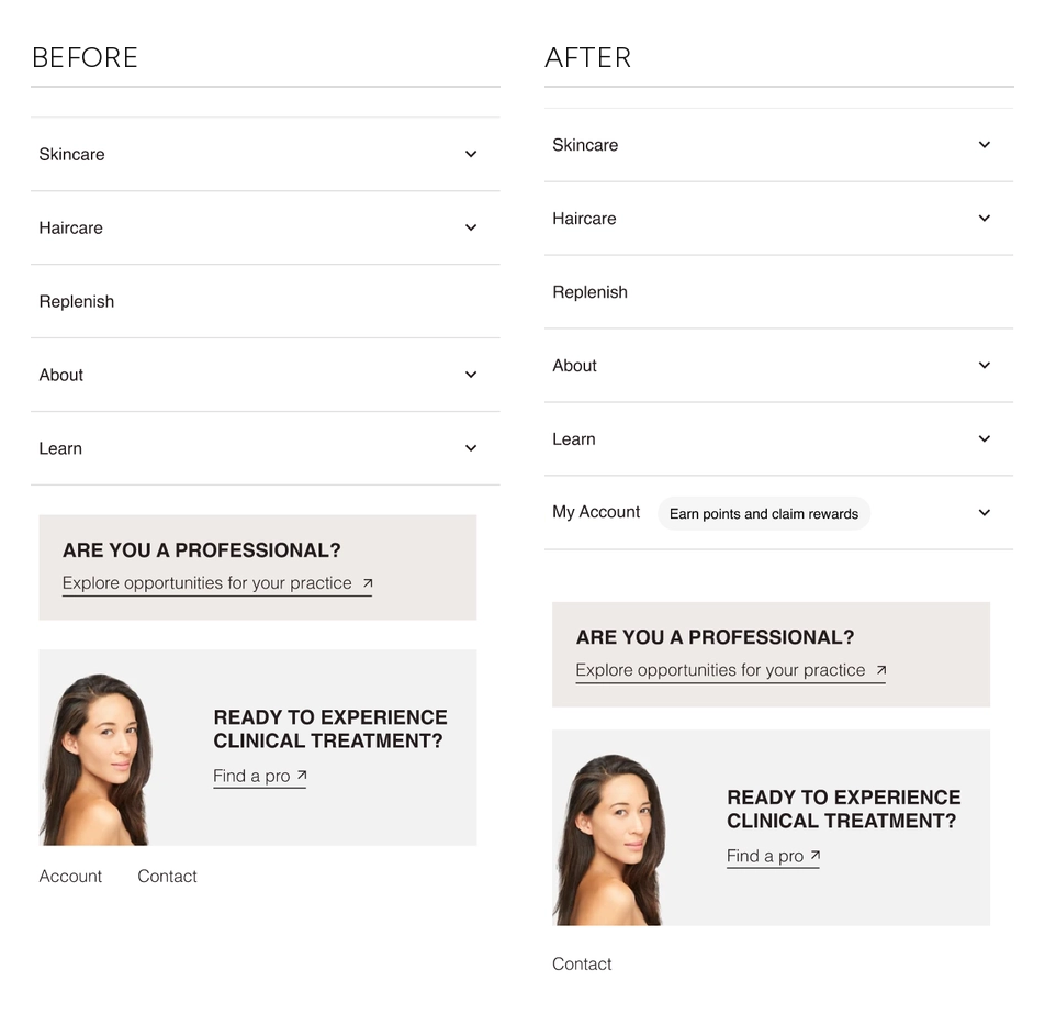
Use Case 1: The Account And Rewards Paths Nobody Could Find
Three of the store's highest-value destinations were effectively unlisted. The rewards programme, account login and the subscription page all sat behind an About menu, and the rewards copy that did exist was described in user feedback as unclear and uninspiring.
That mattered more here than it would on most stores, because the subscription page was already converting at roughly three times the site average. The shortest route to a repeat customer was the one hardest to reach.
We promoted My Account to a top-level menu row and attached a plain statement of what it is for, "Earn points and claim rewards". Opening it now exposes register, login, the rewards club and the subscription page directly, with a rewards card underneath.
Results:
+18% conversion rate on the rewards page, at over 99% confidence
+13% conversion rate on the subscription page, at over 99% confidence
+35% account logins, at 100% confidence
+6% revenue
deployed to all traffic immediately after the test
This was the only test in the programme where every metric moved together at 99 to 100% confidence with nothing moving the other way, across roughly forty-five thousand sessions in each arm over two weeks. It is also the least interesting change in the programme to look at. One menu row, and the three things that bring a customer back all became reachable.
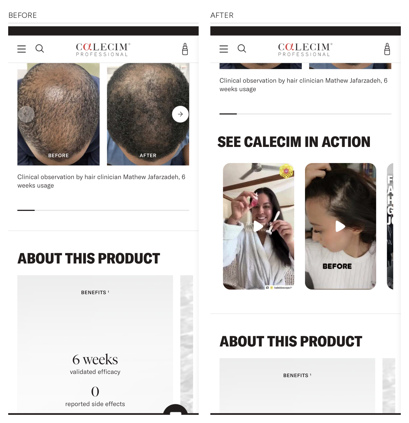
Use Case 2: Customer Video On The Hair Product Page
The hair product page already carried clinical before-and-after photography with a clinician's name attached. What it did not carry was ordinary customers. An earlier three-day run put customer video on the page and produced a purchase-rate signal on a sample far too small to call, which is why it was rerun as a proper test rather than shipped on the strength of it.
The full test inserted a row of customer video clips between the clinical carousel and the product description, so the page moves from clinical evidence to lived evidence before it starts explaining itself.
Results:
+21% purchase rate
+16% revenue per user
+7% add-to-cart
-12% checkout rate
rolled out to all traffic, and extended to the skin serum page
The checkout figure is not a rounding error and it is the interesting part. Purchase rate rose while the rate of shoppers starting checkout fell, so fewer people entered checkout and more of the ones who did finished. Bounce rate rose slightly and sessions got about two seconds shorter over the same window. Read together, that is faster deciding rather than a broken funnel. The page was sorting shoppers earlier instead of carrying more of them further.
Among the shoppers who engaged with the video row, purchase rate ran nearly four times the variant's overall rate. That comparison sits inside the variant, engaged shoppers against all shoppers rather than variant against control, so it describes a difference between audiences rather than measuring a lift. What it does establish is that the people who watch are a materially different group from the people who scroll past, which is why the module earned a full rollout rather than a tweak.
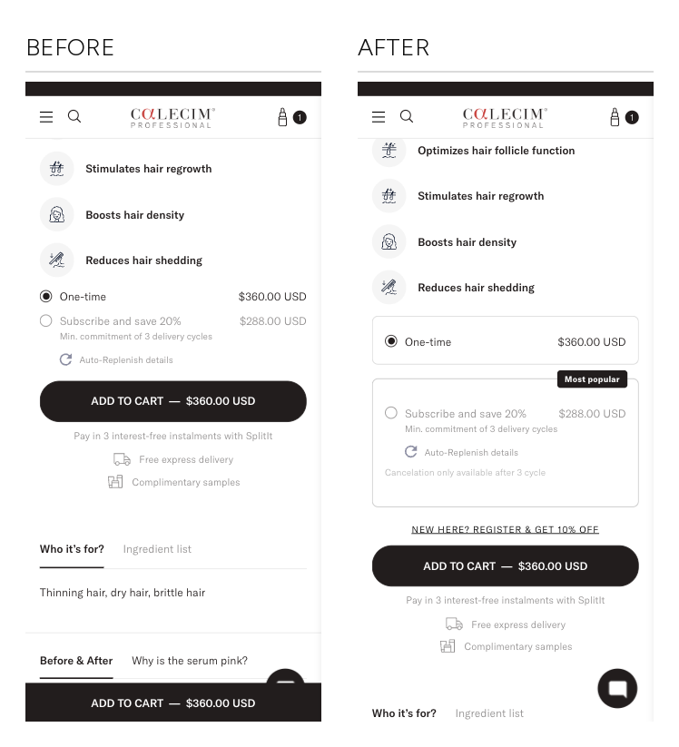
Use Case 3: The Test That Won Its Own Metric And Lost Money
The subscription path was the best-converting route on the store and the audited competitors all defaulted to it, so pushing it harder was a reasonable thing to try. We tried it on first-time visitors to the hair product page.
The variant restyled the buy box into two bordered cards, put a "Most popular" badge on the subscription option, added a register-and-save prompt above Add to Cart, and surfaced the cancellation terms. It worked exactly as designed on the metric it was designed for.
Results:
+82% subscribe clicks, at 100% confidence
-7% conversion rate
-9% purchases
-4% average order value
-8% revenue per visitor
not deployed
Full statistical confidence on the intermediate metric, and money going out the door. The subscribe click was never the goal, it was the proxy, and the proxy moved while the thing it stood for went backwards.
What we take from it is about sequence rather than about subscription. A first-time visitor has not yet decided the product works. Asking them to commit to three delivery cycles, and showing them the cancellation terms while they decide, stacks a second decision on top of one they have not finished making. The same offer, put in front of people who had already bought and already had an account, produced the strongest result in the programme. The variant changed several things at once, so the finding is the direction rather than the element, and the direction was clear enough to stop the rollout.
The Outcome
Measured across a six-month stretch against the equivalent six months a year earlier, the store grew on slightly less traffic than it had before.
Results:
+21% conversion rate
+37% revenue per session
+31% orders
-2% sessions
+4pp returning-customer rate, on +40% more returning buyers
+1% average order value
The traffic mix changed over the same stretch, and that has to be said before the revenue figure means anything. Roughly five points of the session mix moved out of paid social and into organic search, and paid search sessions were cut back almost entirely. Organic search converts better than paid social on nearly any store, so part of the conversion-rate gain is mix rather than on-site work, which is why revenue per session is the figure we quote. Media and channel mix were run by the client's own team throughout and sat outside this scope.
Revenue per session against near-flat sessions is the read that survives the mix change, and it is the figure we would point at. Total revenue grew by roughly a third over the same window, on a traffic mix we did not control, so revenue per session is the figure credited to this work.
Average order value moved by one percent, so the bundle and upsell work has not landed yet. The number we would defend is the retention one: the returning-customer rate rose four points and returning buyers grew by two fifths, and the single strongest test in the programme was the one that made rewards, login and subscription reachable. That is a chain we can follow, and it is the part that compounds.
About the figures. Store figures compare six months against the same six months a year earlier, as the commerce platform reported them. Individual test figures compare a variant against a concurrent control: two weeks for the menu and buy-box tests, ten days for the customer video test. The menu and buy-box tests were significance-tested and their confidence levels are stated. The customer video test was not, so its figures are observed differences and no sample counts were recorded. Engaged-segment comparisons sit within a single variant and are labelled as such. Paid media and channel mix were run by the client's own team throughout and sat outside this scope. Absolute revenue, order and customer volumes are held back for client confidentiality.
Heading 1
Heading 2
Heading 3
Heading 4
Heading 5
Heading 6
Lorem ipsum dolor sit amet, consectetur adipiscing elit, sed do eiusmod tempor incididunt ut labore et dolore magna aliqua. Ut enim ad minim veniam, quis nostrud exercitation ullamco laboris nisi ut aliquip ex ea commodo consequat. Duis aute irure dolor in reprehenderit in voluptate velit esse cillum dolore eu fugiat nulla pariatur.
Block quote
Ordered list
- Item 1
- Item 2
- Item 3
Unordered list
- Item A
- Item B
- Item C
Bold text
Emphasis
Superscript
Subscript

Outcomes That Speak
We focus on tangible outcomes—not just design for design’s sake. Here’s what our clients typically see after we launch or revamp their Shopify websites: