BloomThis
- +10% Revenue growth
- +11% Transactions
- +13% Mobile conversion rate
- +8% Site-wide conversion rate


Country
Malaysia
Services
Conversion Rate Optimization
Industry
Flowers and Gifting
Technology
Shopify
GA4
Klaviyo
Convert
BloomThis is a Malaysian florist selling flowers, plants and gifts for occasions, with same-day delivery across the country. Nearly four in five of its sessions arrive on a phone, and nearly every buyer is shopping for an occasion rather than for a product. Convx by Z21 ran conversion optimisation on that store across four years and more than forty tests.
The Challenges
1. Mobile carried the traffic but not the conversion: The phone accounted for the overwhelming majority of sessions and converted at under half the desktop rate. Any change that did not work on a phone was not going to move the business.
2. Shoppers were buying an occasion, not a product: A birthday, a condolence, a grand opening, a wedding. The store was arranged by product type, so the shopper had to translate an occasion into a category before they could find anything.
3. The menu was ordered by assumption rather than demand: Click data showed the ten most-used menu entries accounted for just over half of all menu usage, and that shoppers were not working down the list in the order it was arranged.
4. Search was the shortest path and the hardest to find: Only a small share of sessions used site search, and the ones that did converted at more than double the site rate. The feature most likely to shorten the journey was the one shoppers were least likely to reach.
Key Objectives
1. Fix The Phone Before Anything Else
2. Organise The Store Around Occasions
3. Put Search Within Reach
4. Know Which Changes Earned Their Place
The Solution
The store was not short of traffic. It was short of shoppers who could reach the right thing quickly.
1. Mobile took priority. In the strongest year of the programme, twenty-six of the tests targeted mobile specifically, because that is where the traffic sat and where the conversion gap was widest.
2. Changes were diagnosed before they were designed. Menu order came from click ranking, search changes came from search behaviour, and the homepage work came from scroll and click depth.
3. Discovery was made shorter, not richer. Suggested searches, a shortcut back to what a returning shopper had already viewed, and a menu ordered by demand.
4. Every change ran against a control, and the ones that lost were reverted and written up rather than quietly dropped.
Use Case 1: Suggested Searches, And What They Actually Moved
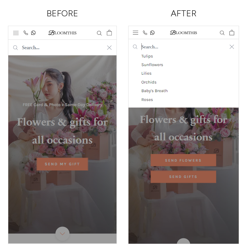
The search field was already the highest-converting route through the store and almost nobody used it. Opening it presented an empty box and a blinking cursor, which asks the shopper to know the name of what they want. For someone buying flowers for an occasion, that is often the one thing they do not know.
We put six suggested flower types into the field before any typing: tulips, sunflowers, lilies, orchids, baby's breath, roses. The shopper picks instead of recalling.
Results:
+21% unique searches
+18% conversion rate within sessions that used search
-21% search refinements needed
+15% search exits
That last line is the finding, and so is what did not move. An easier way to search pulled in lower-intent sessions alongside the higher-intent ones, so the searching segment improved while the site-wide rate stayed where it was. Both are true at once, and a lift inside a segment is not a lift on the store. What this change moved was who converted, not how many.
Use Case 2: Putting Returning Shoppers Back Where They Stopped
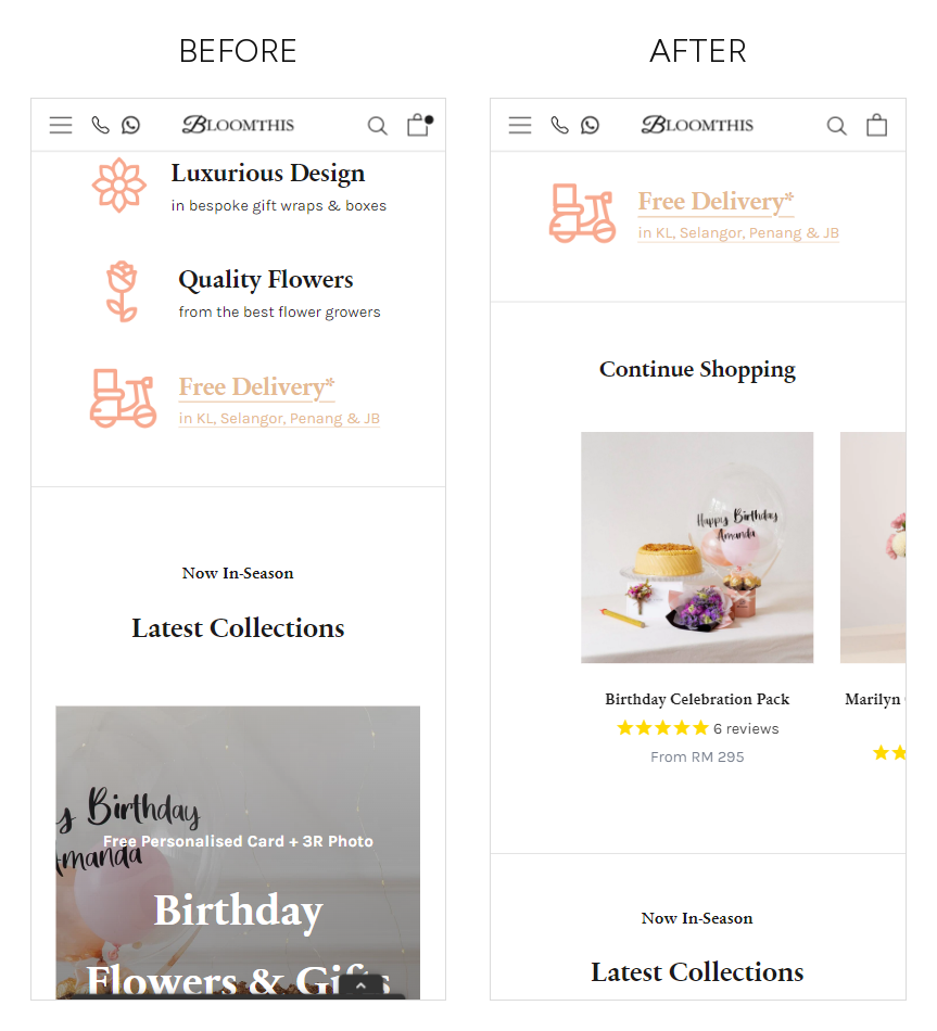
Gifting carries an unusually long deliberation for a small basket. Shoppers leave, think about it, and come back to a home page that behaved as though they had never visited, so they had to find their way back to the thing they had already chosen.
We inserted a row of the shopper's own previously viewed items above the first collection block, so a returning session opens on the decision it left behind rather than at the start of the store.
Results:
+7% home page click-through
highest conversion after click of any element on the page
rolled out to all traffic
The mechanic is now standard practice across gifting stores. It was not obvious at the time, and it earned its place on the page by beating the block it displaced rather than by being added alongside it.
The Outcome
In the one full year where traffic held roughly steady, the programme showed up cleanly. Transactions and revenue both grew several times faster than the visitor count, and mobile, where the work was aimed, moved most.
Results:
+11% transactions on +3% visitors
revenue growth close to ten percent on the same +3% visitors
+13% mobile conversion rate on +6% mobile sessions
+8% site-wide conversion rate
Desktop conversion slipped slightly across the same window, which is why the mobile figure is the one quoted rather than a blended one.
What happened in the later stretch matters just as much, and it is not a conversion story. Traffic scaled steeply as paid and social investment grew, and the site-wide conversion rate fell as it did, because the mix arriving converted well below the store's own average. Media sat outside this scope throughout. Organic conversion across the same stretch was flat rather than falling, which is the cleaner read on what the on-site work was holding up.
Across four years of testing, the durable claim is the narrow one: testing made the traffic the store already had worth more per visit. On the programme's own attribution that was roughly a tenth of the revenue growth in its strongest year, and it is the part that holds when media spend moves.
About the figures. Conversion rate is transactions as a share of sessions, except the yearly site-wide and mobile figures, which are the user-based rate as the analytics platform reported it. Programme figures compare a full year against the prior full year; individual test figures compare a test window against the period immediately before it, between two and four weeks depending on the test. No test in this programme was significance-tested, so every figure is an observed difference rather than a proven effect, and several sit on small transaction counts. Paid media and channel mix were run by the client's own team throughout and sat outside this scope. Absolute revenue, traffic and order volumes are held back for client confidentiality.
Heading 1
Heading 2
Heading 3
Heading 4
Heading 5
Heading 6
Lorem ipsum dolor sit amet, consectetur adipiscing elit, sed do eiusmod tempor incididunt ut labore et dolore magna aliqua. Ut enim ad minim veniam, quis nostrud exercitation ullamco laboris nisi ut aliquip ex ea commodo consequat. Duis aute irure dolor in reprehenderit in voluptate velit esse cillum dolore eu fugiat nulla pariatur.
Block quote
Ordered list
- Item 1
- Item 2
- Item 3
Unordered list
- Item A
- Item B
- Item C
Bold text
Emphasis
Superscript
Subscript

Outcomes That Speak
We focus on tangible outcomes—not just design for design’s sake. Here’s what our clients typically see after we launch or revamp their Shopify websites: