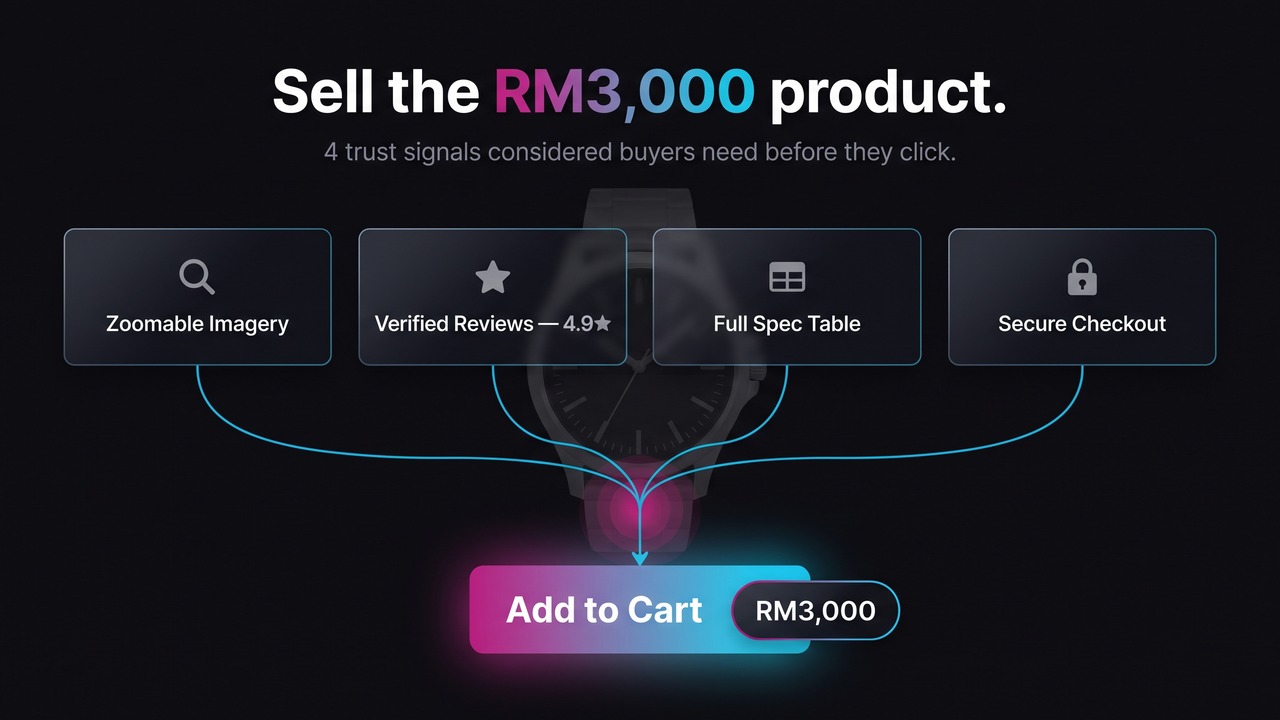
To lift conversions on a high-priced product page, treat the PDP as a risk-reduction page, not a description page. Higher-AOV, considered purchases like jewellery, watches, supplements and premium beauty carry more perceived risk, so the buyer needs more evidence before they commit: deep product information and specifications, imagery that stands in for handling the item, market-specific trust signals placed at the decision point, and credible social proof. Reviews matter disproportionately here. The Spiegel Research Center found that reviews lift purchase likelihood by 380% for higher-priced products versus 190% for cheaper ones. The job of a considered-purchase product page is to answer every "can I trust this, and is it right for me" question before the shopper has to go looking for the answer somewhere else.
Why do higher-priced product pages need a different approach than impulse-buy pages?
A considered purchase is one the buyer thinks about before committing, because the stakes are higher. On a RM3,000 watch or a three-month supplement stack, the risk is financial, but it is also about identity and, for supplements and beauty, health and appearance. An impulse buy carries almost none of that. The buyer wants a quick nudge and a fast checkout, and a short, punchy product page does the job.
For higher-priced products the page has to do the opposite. It has to give the buyer room to evaluate and remove every reason to leave and "research it later", because most of them never come back. Baymard Institute's usability testing found participants often abandoned suitable products solely because of resolvable UX issues on the product page. Unresolved uncertainty on the PDP does not sit still, it turns into abandonment at checkout or a silent bounce.
| Impulse-buy PDP | Considered-purchase PDP | |
|---|---|---|
| Buyer mindset | Quick nudge, low deliberation | Evaluating risk, comparing, deliberating |
| Information depth | Short, benefit-led | Deep specs, layered detail, answers objections |
| Role of social proof | Light reassurance | Central, especially reviews and verified buyers |
| Trust signals | Standard checkout cues | Authenticity, warranty, certifications, returns |
| Primary job of the page | Speed to checkout | Reduce perceived risk before checkout |
Everything below is the considered-purchase column.
What product information and specifications should a high-AOV PDP include?
Give the buyer enough to make a confident decision without leaving the page. The structure that works is layered: a clear value proposition up top for the fast scanner, and full detail below for the buyer who reads everything before spending RM3,000.
Structure the information in this order:
- Lead value proposition. One or two lines directly under the title on what the product is and who it is for. Not marketing fluff, the actual reason this item suits this buyer.
- Specification table. Materials, dimensions, movement or ingredients, compatibility, care. Considered buyers read specs, so make them scannable in a labelled table, not buried in a paragraph.
- Usage, care and authenticity. How to use or wear it, how to care for it, and proof it is genuine. For watches and jewellery that means materials and authenticity documentation. For supplements it means dosage and ingredient transparency.
- Shipping, returns and warranty, on the page itself. Do not make the buyer hunt. Baymard found 67% of sites don't show a total order cost estimate on the product page and 44% don't display or link the return policy from the main content. On a high-AOV item, an unclear returns policy is a deal-breaker, because the buyer is pricing in the risk of being stuck with something expensive that is wrong.
Long pages are fine for considered purchases as long as they are scannable. Use collapsible sections with clear titles so the fast scanner and the deep reader both get what they need.
What imagery and video convert best for considered purchases?
Imagery is the stand-in for physically handling the product, so on a high-priced PDP it carries more weight than the copy. The buyer cannot pick up the watch or feel the cream, so the images have to close that gap.
The essentials for considered categories:
- In-scale images that show real size. Baymard found 37% of sites don't provide in-scale imagery, which leaves the buyer guessing on a purchase where size is central.
- Human-model or on-body shots for anything wearable. 23% of sites omit these for wearables and accessories, per the same benchmark. A watch on a wrist and jewellery on skin resolve questions no flat-lay can.
- Zoom on materials, finish and detail, because craftsmanship is a big part of what the buyer is paying for.
- Video where it shows texture, operation or scale better than a still, for example a watch movement or how a serum absorbs.
- User-generated content in the gallery. Real customers using the product in familiar settings does more for trust than a polished studio shot.
This is not theory. In one Convx product-page test, expanding the visual preview on the PDP drove a +8.7% conversion rate, +13% product views and +14% revenue. Giving buyers more and better ways to see the product before they commit moved the number that matters.
Which trust signals actually matter on a high-priced product page?
Trust signals matter most at the point of decision, which is next to the price and the add-to-cart button. On a considered purchase the buyer is actively looking for reasons to trust an unfamiliar brand with a large amount of money, so put the reassurance where the hesitation happens.
The ones that earn their place:
- Authenticity and warranty. For watches, jewellery and premium goods, state the warranty and any authenticity guarantee plainly. This is the single biggest anxiety for these categories.
- Certifications that are real. Halal certification for supplements sold in Malaysia, ingredient or safety certifications for beauty, materials certification for jewellery. Only show what you actually hold, because a fake or vague badge does more harm than none.
- Secure-checkout and payment cues near the CTA. Recognisable payment logos and a secure-checkout line directly answer the buyer's fear of handing card details to a site they do not know well.
- A brand response to negative reviews. Baymard found 89% of sites don't respond to negative reviews. A calm, helpful reply to a critical review is one of the strongest trust signals available, and almost nobody uses it.
For brands selling cross-border across APAC, add a layer most local guides skip. Be honest about delivery time to each market rather than hiding it, make cross-border returns clear before purchase, and include a short, plain line on how you handle personal and payment data. For a PDPA-conscious audience, an honest data-handling line lowers perceived risk far more than a generic seal does.
How much do reviews and social proof affect conversion for expensive products?
More than almost anything else on the page. The Spiegel Research Center analysis is the clearest evidence: purchase likelihood for a product with five reviews is 270% higher than for a product with none, and for higher-priced products that lift reaches 380%. Reviews are not a nice-to-have on a high-AOV PDP, they are a primary conversion driver.
Four practical rules come straight out of that research:
- Get the first five reviews above all else. The marginal benefit drops off sharply after five, so a product sitting on zero reviews is leaving the biggest gain on the table. Prioritise review-request flows for your high-AOV lines.
- Do not chase a perfect 5.0. Purchase likelihood peaks in the 4.0 to 4.7 range and then falls as it approaches 5.0, because a flawless score reads as fake. A handful of honest three-star reviews makes the five-stars believable.
- Show the verified-buyer badge. Verified-purchaser reviews improve purchase odds by 15% over anonymous ones. On an expensive item, proof the reviewer actually bought it carries real weight.
- Place it for both reading patterns. Put the star rating and review count above the fold near the title, and the full, filterable review section lower down. Attention on considered PDPs is intense at the top and re-engages in the reviews section at the bottom, so serve both.
How do you optimise product pages differently for jewellery, watches, supplements and premium beauty?
The framework is the same, the emphasis shifts by category and by what the buyer is most afraid of getting wrong.
- Jewellery and watches. Authenticity is everything. Lead with materials, craftsmanship and warranty, use in-scale and on-body imagery, and make authenticity documentation visible. The fear is buying a fake or misjudging the size.
- Supplements. Ingredient transparency, dosage clarity and certifications carry the sale. Halal certification matters in Malaysia. Show price-per-unit and per-serving cost, which Baymard notes 81% of sites omit for multi-quantity products, and offer a subscription option since these are repeat purchases. The fear is safety and whether it works.
- Premium beauty. Shade, texture and results decide it. Use before-and-after UGC, clear ingredient claims, and shade or texture guidance, and make returns generous and obvious. The fear is that it will not suit their skin or match expectations.
Frequently Asked Questions
What is the single highest-impact change on a high-priced product page?
Reviews and social proof, if you are starting from few or none. Spiegel found reviews lift purchase likelihood by 380% for higher-priced products, so getting credible, verified reviews onto a bare PDP usually beats any layout change. After that, the next biggest wins are placing trust signals next to the add-to-cart button and improving imagery.
How many reviews do I need before it moves conversion?
The first five do most of the work. Spiegel found purchase likelihood jumps sharply up to five reviews and the marginal benefit drops off after that. So the priority is getting any high-AOV product from zero to a handful of genuine, verified reviews, rather than chasing hundreds on products that already have some.
Should I aim for a perfect 5-star rating?
No. Purchase likelihood peaks between 4.0 and 4.7 and then falls as the rating nears 5.0, because a perfect score looks manipulated. Keep the honest mix of ratings, and respond helpfully to the negative ones, which is itself a strong trust signal.
Do trust badges actually help or are they just noise?
Real ones help, generic ones do not. Certifications you actually hold, a stated warranty, a clear returns policy and secure-checkout cues placed next to the buy button reduce real anxiety. A vague or fake badge adds clutter and can backfire. The test is whether the signal reflects a real policy the buyer can rely on.
How is a considered-purchase product page different for cross-border APAC buyers?
Add honesty about delivery time to each market, make cross-border returns clear before purchase, show any local certifications such as halal, and include a plain line on how you handle personal and payment data. Cross-border buyers are pricing in more risk, so the trust layer has to be heavier and more specific per market.
Where to start
Do not rebuild the whole page at once. Pick your highest-traffic, highest-AOV product page and fix it in this order: get credible verified reviews on it, move your real trust signals next to the add-to-cart button, then upgrade the imagery to in-scale and on-body shots. Then A/B test the change rather than assuming it worked.
If you are already paying to send traffic to a high-priced product page that is not converting, that is a conversion problem, not a traffic problem. As a Shopify Plus Partner working with MY and SG brands, Convx runs CRO audits and A/B tests on product pages and CRO-focused Shopify builds that find exactly where a considered-purchase PDP is losing the sale. If you want a second set of eyes on your highest-value product pages, talk to us.