Lachér Patisserie
- +6.8% Purchase rate
- +8.7% Add-to-cart rate
- +10.9% Items per basket
- +14% Product card clicks

Country
Malaysia
Services
Conversion Rate Optimization
Industry
Food and Beverages
Technology
Shopify
GA4
FigPii
Zapiet
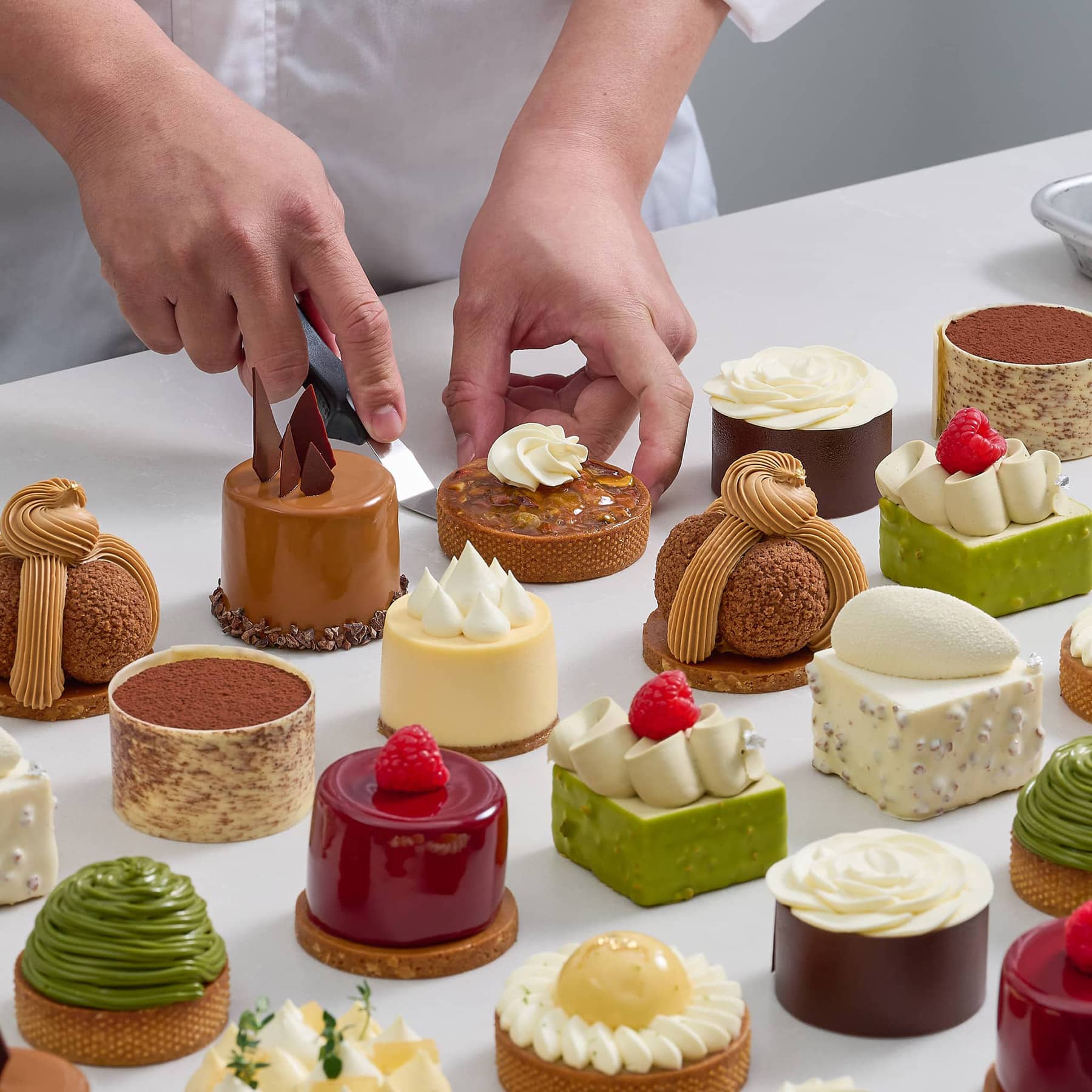
Lachér Patisserie makes French-style cakes and tarts for delivery across Kuala Lumpur and Selangor, with a catalogue built around fulfilment windows rather than categories: same-day if you order before the cut-off, one-day preorder for the rest, and petit gateaux on three days a week. Convx by Z21 ran conversion optimisation on the store.
The Challenges
1. A catalogue organised around logistics, not appetite: Products were grouped by when they could be delivered, which is what the kitchen needs to know and not what a shopper cares about. Someone buying a birthday cake is choosing a flavour and an occasion, and the site asked them to think in cut-off times.
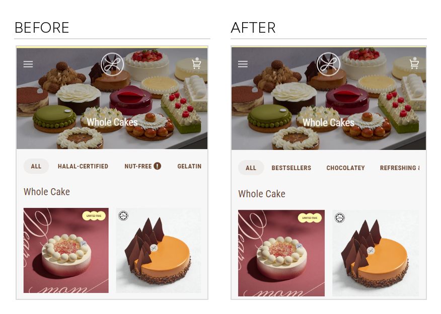
2. Fifteen cakes and almost no way to narrow them down: The main collection page offered a halal grouping and a nut-free option. Nothing let a shopper filter by taste, by who the cake was for, or by what was selling. Choice without a way through choice is just friction.
3. Search was not the answer either: Site search was reaching about one session in five hundred. Whatever discovery happened had to happen through browsing, which put all the weight on navigation, collection layout and filters.
4. Most product page visits ended without an add to cart: More than seven in ten shoppers who reached a product page left without adding anything, and the buy button scrolled out of view on the way down.
Key Objectives
1. Let Shoppers Narrow By Taste, Not By Logistics
2. Fit More Of The Catalogue Into The Same Scroll
3. Keep The Buy Button Reachable
4. Make Delivery Cost Visible Before Checkout
The Solution
With search barely used, browsing was the only route to a cake. So the work went into the collection page, the filters and the product page.
1. Around twenty A/B tests over the engagement, roughly half producing a change worth keeping. Each ran against a concurrent control on the live store.
2. Discovery rebuilt around how people choose cake: filters by flavour and by who it is for, and a collection layout that shows more of the range at once.
3. Product page friction removed step by step, starting with keeping the add to cart within reach and ending with the cost of delivery being visible before checkout.
4. Every result read against its own control, and reported with the metrics that moved against us alongside the ones that moved for us.
Use Case 1: Filters That Match How People Choose Cake
The collection page listed the whole range with a filter row offering halal certification and a nut-free option. Useful if you have a dietary requirement, no help at all if you are simply trying to pick a cake. We replaced it with filters people actually shop by: bestsellers, chocolatey, refreshing and fruity, nutty, classics, and who the cake is for, including kid-friendly and elderly-friendly.
Results:
+8.7% add-to-cart rate from the product listing
+6.8% purchase rate
+2.7% average order value
engagement with the filter bar rose by close to half
This was the best-evidenced result of the engagement, and the one the kick-off research had predicted: shoppers abandon a selection process that gets difficult, and difficulty arrives faster when everything on the page is appealing.
Use Case 2: A Grid Instead Of A Carousel, On Mobile
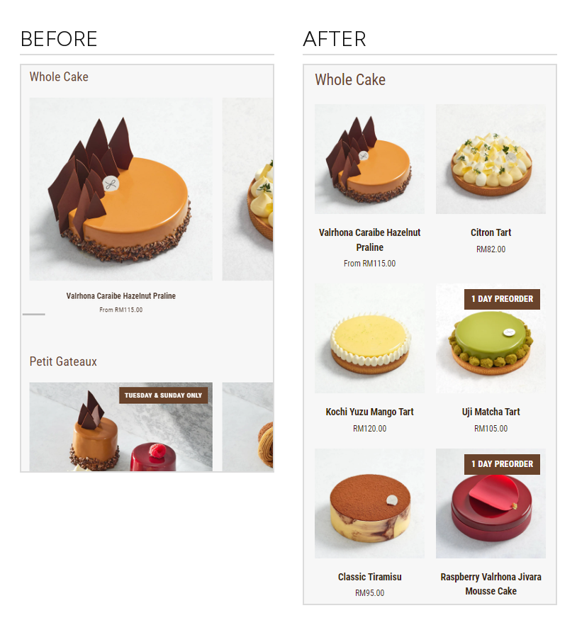
Collection sections on mobile were carousels, showing one cake at a time with the rest behind a horizontal swipe. Behavioural data showed attention dropping sharply after the fourth card, so most of the range was never seen. We tested a two-column grid instead.
What changed: six cakes visible in the space that previously showed one, with no swiping required
Product card clicks: +14%
Add-to-cart rate: +6.4%, with purchase rate up roughly 2%
The interesting part: the grid won even though it made every product image smaller. Being able to see the range mattered more than seeing any one cake larger
Average order value fell slightly in the grid, so this is a discovery and add-to-cart result rather than a basket-size one.
Use Case 3: Small Product Page Changes, Measured Properly
Three separate tests on the path from product page to checkout, each modest on its own and each verified against its own control rather than assumed.
A sticky add to cart: the buy button follows the shopper down the page once the original scrolls out of view. +5.4% add-to-cart rate, +2.4% purchase rate. This was the first test of the engagement
A red add to cart: swapping the brand brown for red on the button alone. +6.4% add-to-cart rate, a third more items added to cart, and +10.6% average order value
A free delivery progress bar in the cart: showing how much more is needed to reach free delivery, instead of leaving shipping cost to be discovered at checkout. +10.9% items per shopper who added to cart
Two caveats worth stating. The sticky button's headline is a blend of two shopper segments and one of those segments got slightly worse. The progress bar improved how much stayed in the basket rather than how many people checked out, which is a smaller claim than it first looks. Both are still wins, just narrower ones than a single percentage suggests.
The Outcome
The wins came from discovery, not from persuasion. The strongest results all made the catalogue easier to get through.
Results:
+8.7% add-to-cart rate and +6.8% purchase rate from flavour and audience filters
+14% product card clicks from replacing mobile carousels with a grid
+10.9% items per basket from making delivery cost visible in the cart
around twenty tests, roughly half producing a change worth keeping
About the figures. Every percentage above is an A/B test result measured against its own concurrent control on the live store, not a period-over-period comparison, which matters for a business this seasonal. Add-to-cart rate and purchase rate are measured from the product listing onward. The grid test ran on mobile only and excluded one collection. Where a secondary metric moved against us, including average order value in the grid test and one shopper segment in the sticky-button test, it is stated alongside the win. No significance testing was performed on these experiments, so they are reported as observed differences rather than as statistically proven effects. Paid media, email and SEO sat outside this scope. Absolute revenue, traffic and order volumes are held back for client confidentiality.
Heading 1
Heading 2
Heading 3
Heading 4
Heading 5
Heading 6
Lorem ipsum dolor sit amet, consectetur adipiscing elit, sed do eiusmod tempor incididunt ut labore et dolore magna aliqua. Ut enim ad minim veniam, quis nostrud exercitation ullamco laboris nisi ut aliquip ex ea commodo consequat. Duis aute irure dolor in reprehenderit in voluptate velit esse cillum dolore eu fugiat nulla pariatur.
Block quote
Ordered list
- Item 1
- Item 2
- Item 3
Unordered list
- Item A
- Item B
- Item C
Bold text
Emphasis
Superscript
Subscript

Outcomes That Speak
We focus on tangible outcomes—not just design for design’s sake. Here’s what our clients typically see after we launch or revamp their Shopify websites: