FLYCO
- 2.2x Conversion rate
- +127% Orders
- 4 Months of CR improvement

Country
Singapore
Malaysia
Services
Conversion Rate Optimization
Industry
Luggage & Travel Accessories
Technology
Shopify
Customily
GA4
Klaviyo
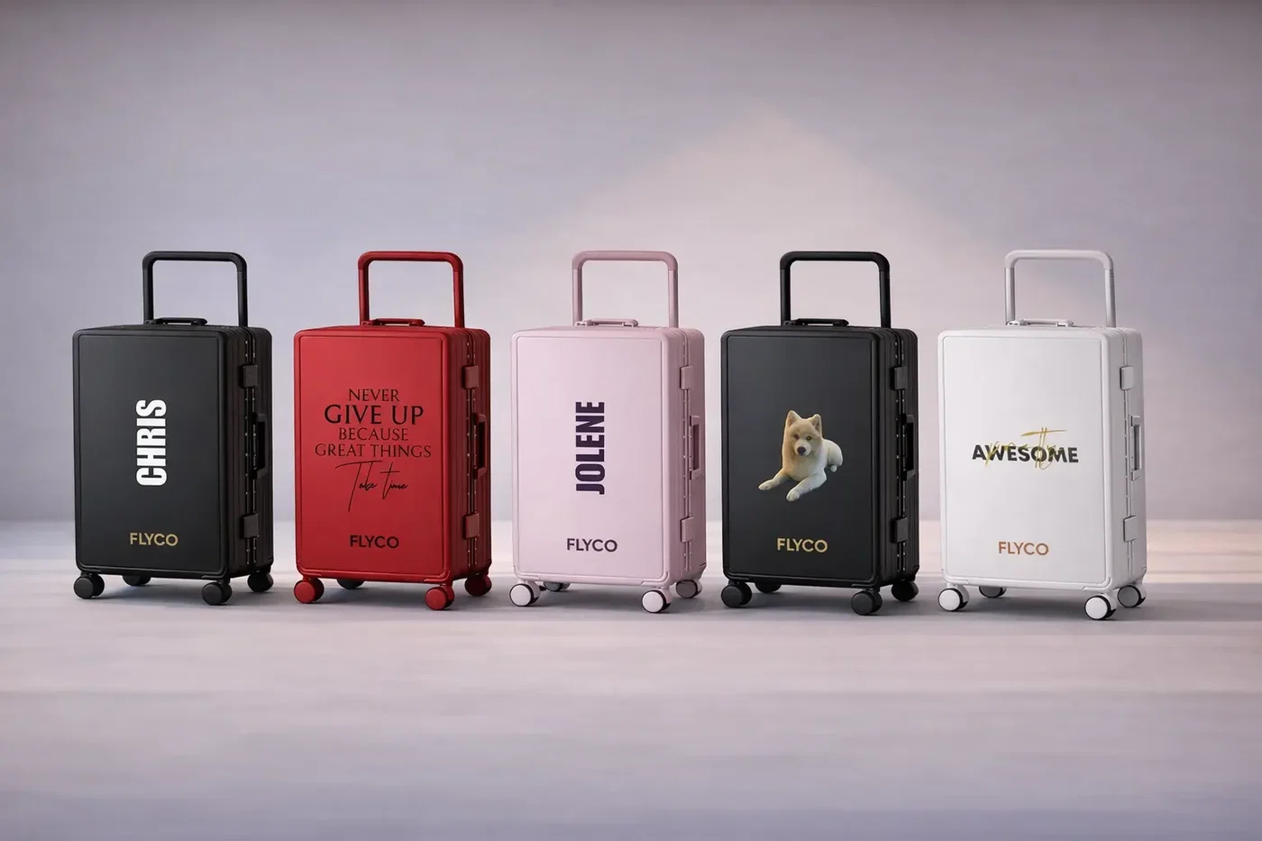
Flyco sells personalised hard-shell luggage across Singapore and Malaysia. Every bag carries the buyer's name plus their choice of font, handle, wheel and luggage colour, which makes the product page the most important screen in the business. Convx by Z21 took that page apart, rebuilt it, and then kept testing it.
The Challenges
1. The product page was the largest leak in the funnel: Almost every product view ended without an add to cart, running roughly three percentage points below the luggage category benchmark. Traffic was arriving in volume and the page could not convert it.
2. Five customisation choices arrived at once: Luggage colour, handle colour, wheel colour, font colour and the name field were all presented at the same time, in a flat list, before the buyer had settled on a size. The feature the brand competes on was the same feature stalling the decision.
3. The page argued with itself: Marketing copy led above the fold instead of the product. Colour options sat three scrolls down. A countdown timer held the space where trust signals belonged, while duplicate trust blocks, floating buttons and repeated copy competed for the same attention.
4. Sizes were described in inches, not in trips: Buyers had to choose between 20, 24, 26, 28 and 32 inches with no guidance on what any of it meant for the way they travel. For someone buying their first piece of personalised luggage, that is where the session ends.
Key Objectives
1. Fix The Product Page Before Anything Else
2. Sequence The Customisation Journey
3. Rebuild Trust Above The Fold
4. Prove Each Change, Then Keep Testing
The Solution
The traffic was already being paid for. The product page was losing the buyers it brought in.
1. No site redesign. The product page was rebuilt first because it was the largest measurable leak, and every later change had to earn its place against that page.
2. Customisation was sequenced, not reduced. Size first, then one guided design step, then add to cart.
3. Anything that did not help the decision came off the page, including the countdown timer. Page length dropped by half.
4. Changes were shipped and measured, and the questions worth settling properly went into A/B tests. Winners scaled, losers reverted.
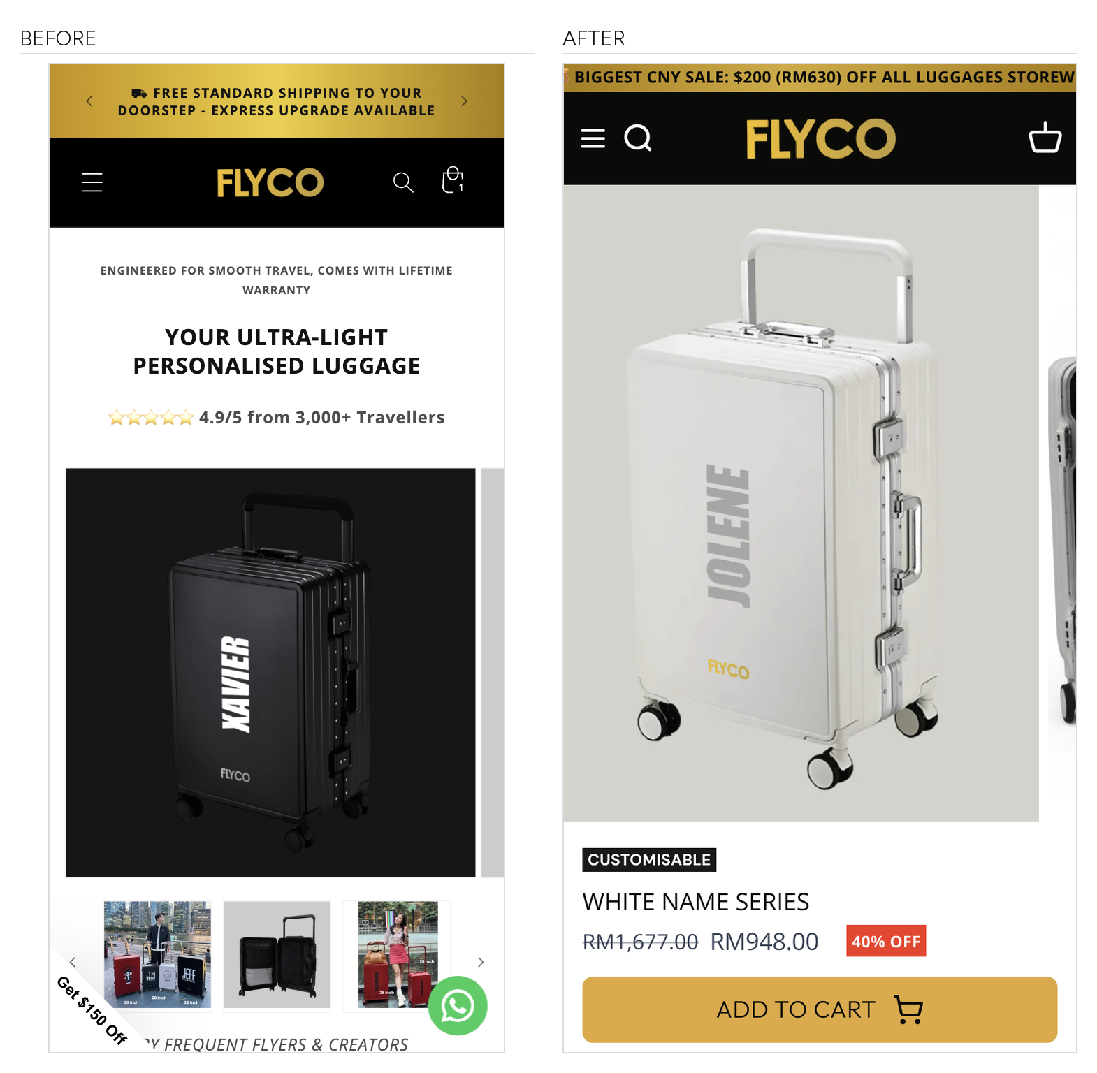
Use Case 1: Rebuilding What The Buyer Sees First
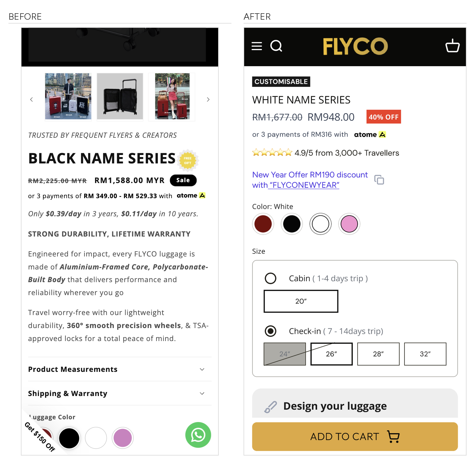
The old above-the-fold zone opened with a line of marketing copy and a dark studio image, with no price and no add to cart in view. We rebuilt it around the product: the personalised bag first, then the series name, then the price, then a full-width add to cart, all before the first scroll. Specifications collapsed into scannable sections, and a trust row covering shipping, lifetime warranty and WhatsApp support took the space the countdown timer used to hold. Add to cart repeats at the foot of the page so it stays within thumb reach.
Measured across a two-week window against the two weeks immediately before it, with both the rebuilt product page and a new theme live:
Results:
+53% sales
+40% conversion rate
+43% add-to-cart rate
+56% reached checkout
+60% returning customer rate
all on +3% sessions
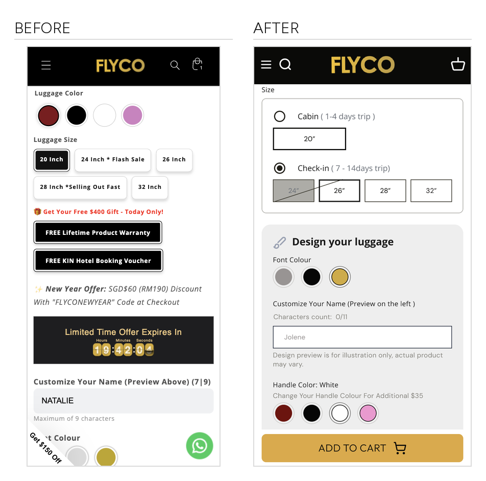
Use Case 2: Turning Five Simultaneous Choices Into One Guided Journey
The five selectors were not removed, they were ordered. Size comes first and is framed around the trip rather than the tape measure. Everything to do with appearance then sits inside a single "Design your luggage" card, where font colour, the name field and handle colour follow in the order a buyer actually decides them. Add to cart sits directly beneath.
Size: the inch measurements were nested under trip length, "Cabin (1 to 4 days)" and "Check-in (7 to 14 days)", so the first choice is about the trip rather than the tape measure
Personalisation: the name field moved out from under the colour selectors into its own card with a live preview and a character count
Scarcity: the countdown timer and the stacked free-gift claims that broke up the sequence were removed
Depth: product page length reduced by half
The Outcome
Across four consecutive months, conversion rate improved every month. None of that came from buying better traffic, because media was never part of this scope.
Results:
2.2x conversion rate
+127% orders
four consecutive months of conversion-rate improvement
The rebuilt product page and the theme migration went live close together, so no single change takes full credit for the movement in the funnel. What the work changed is how much of the existing traffic the page could convert. The same visits, asked to make fewer decisions in a clearer order, produced more than twice as many orders.
About the figures. Conversion rate is orders as a share of sessions, and add-to-cart rate is add-to-cart sessions as a share of sessions, both from the store's own analytics. The four-month figures compare the fourth month against the first. The use-case figures compare a two-week window against the two weeks immediately before it, with both the rebuilt product page and a new theme live in that window, so they measure the two together rather than either one alone. A/B test figures are the platform's results at conclusion. Paid media was run by the client's own team throughout and sat outside this scope. Absolute revenue, traffic and order volumes are held back for client confidentiality.
Heading 1
Heading 2
Heading 3
Heading 4
Heading 5
Heading 6
Lorem ipsum dolor sit amet, consectetur adipiscing elit, sed do eiusmod tempor incididunt ut labore et dolore magna aliqua. Ut enim ad minim veniam, quis nostrud exercitation ullamco laboris nisi ut aliquip ex ea commodo consequat. Duis aute irure dolor in reprehenderit in voluptate velit esse cillum dolore eu fugiat nulla pariatur.
Block quote
Ordered list
- Item 1
- Item 2
- Item 3
Unordered list
- Item A
- Item B
- Item C
Bold text
Emphasis
Superscript
Subscript

Outcomes That Speak
We focus on tangible outcomes—not just design for design’s sake. Here’s what our clients typically see after we launch or revamp their Shopify websites: