Apple Premium Reseller Malaysia
- +223% Add-to-cart clicks
- +40% Collection-page conversion rate
- +33% Search usage
- +20% Basket size


Country
Malaysia
Services
Conversion Rate Optimization
Industry
Electronics & Technology
Technology
Shopify
GA4
Google Optimize
Convert.com
An Apple Premium Reseller retail chain in Malaysia, selling the full Apple range online and through its own outlets. Convx by Z21 ran conversion optimisation on the storefront as a continuous programme rather than a project, shipping and testing against the same catalogue for five years.
The Challenges
1. A fixed catalogue and a fixed price: An authorised reseller cannot discount Apple hardware or change the product range to compete. The only levers left are how the catalogue is presented, how easily a shopper finds the right model, and what else goes into the basket. That makes conversion work the whole growth strategy, not a supporting one.
2. High-consideration products with near-identical siblings: A shopper choosing between five current iPhone models is doing genuine comparison work. Where the site made that work harder, the shopper left to do it somewhere else and bought somewhere else too.
3. Accessories were left to chance: Roughly one iPhone or iPad order in four carried an accessory, a protection plan or another add-on. The attach opportunity was real and the product page was not doing much to earn it.
4. Discovery tools existed but went unused: Site search was reaching a tiny fraction of sessions, and fewer than one session in forty touched the model comparison tool. Features the business had already paid to build were invisible in practice.
Key Objectives
1. Earn More From Every Order Without Touching Price
2. Make Model Comparison Easy Enough To Finish
3. Turn Unused Discovery Tools Into Used Ones
4. Decide By Test, Not By Opinion
The Solution
With price and product fixed, the storefront was the only variable left. So it became the one we worked on, continuously.
1. A standing programme rather than a redesign. Research, design, front end and measurement sat with one team on a fixed monthly allocation, so a finding could become a live change without a handover.
2. Several hundred changes shipped across the storefront, including more than a hundred site hygiene fixes and over a hundred and fifty page and component changes.
3. Dozens of controlled A/B tests, run at a steady cadence of roughly three live every month rather than in bursts.
4. Losers reverted and reported. The tests below include one where the headline metric did not move, because that is what the data said.
Use Case 1: Rebuilding The Add-On Module On The Product Page
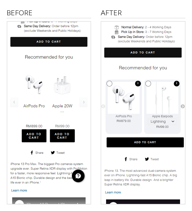
The accessory module under the buy button was a carousel. Each accessory carried its own add to cart, so a shopper who wanted two things had to add them one at a time, and anything past the first two items was hidden behind an arrow. We rebuilt it as a set of selectable cards, each with an information button and its own variant picker where one was needed, and put a single add to cart underneath the whole set.
Results:
+223% add-to-cart clicks from the add-on section, close to a tripling
+46% clicks on the product cards themselves
2.25x revenue from the module
units sold through the module nearly tripled
Use Case 2: Putting The Store's Own Demand Into The Search Bar
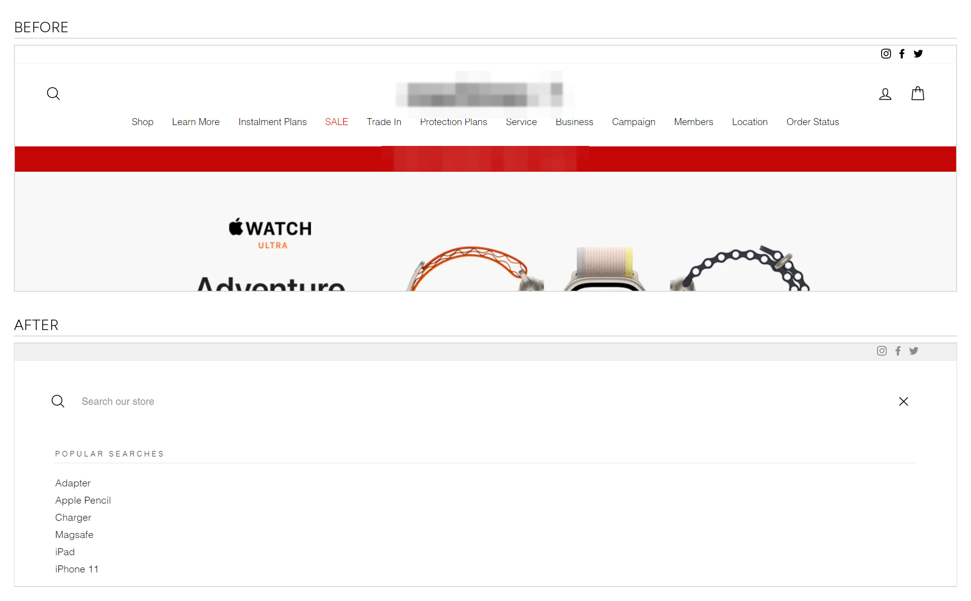
Search was one of the highest-intent behaviours on the site and one of the least used. Tapping the icon opened an empty field, so a shopper had to already know both what they wanted and what the store called it. We replaced the empty state with the store's most popular searches, surfaced the moment the panel opens.
Results:
+33% clicks on the search icon on desktop
+47% clicks through to a product listing after searching
+20% searches actually submitted
+20% average basket on search sessions
Use Case 3: The Same Component, Two Positions, Two Outcomes
The model comparison tool was reaching fewer than one session in forty, despite being the exact thing a shopper choosing between near-identical models needs. Rather than redesign it, we tested moving it, running two variations that placed the same component at two different heights on the collection page.
Higher placement: +40% collection-page conversion rate and +22% revenue per visitor against control
Lower placement: barely separated from control
What that proves: the component was never the problem, its position was. Nothing about the tool itself changed between the two arms
The Outcome
Five continuous years on the same storefront, with the catalogue and the pricing fixed throughout.
Results:
+223% add-to-cart clicks from the rebuilt add-on module, and 2.25x its revenue
+40% collection-page conversion rate from repositioning the comparison tool
+33% search usage, and +20% basket size on search sessions
several hundred changes shipped, dozens of them controlled tests
These are individual test results against their own controls, which is the honest unit for a programme this long. Traffic, pricing, product launches and promotions all moved over five years and none of them were ours, so we do not claim a site-wide conversion figure. What the programme changed is what each visit was worth once it arrived: more orders carrying an add-on, more shoppers finishing a model comparison, and a search tool that people actually used.
About the figures. Every percentage above is a controlled A/B test result measured against its own concurrent control, not a period-over-period comparison. Test windows ran from fourteen to twenty-one days. Conversion rate is transactions as a share of sessions and add-to-cart rate is add-to-cart events as a share of sessions, taken from the testing platform and the store's own analytics. Where a secondary metric moved against us, such as average order value in the add-on and comparison tests, it is stated in the same breath as the win. Paid media, pricing and product range were never in this scope. Absolute revenue, traffic and order volumes, and the client's identity, are held back for confidentiality.
Heading 1
Heading 2
Heading 3
Heading 4
Heading 5
Heading 6
Lorem ipsum dolor sit amet, consectetur adipiscing elit, sed do eiusmod tempor incididunt ut labore et dolore magna aliqua. Ut enim ad minim veniam, quis nostrud exercitation ullamco laboris nisi ut aliquip ex ea commodo consequat. Duis aute irure dolor in reprehenderit in voluptate velit esse cillum dolore eu fugiat nulla pariatur.
Block quote
Ordered list
- Item 1
- Item 2
- Item 3
Unordered list
- Item A
- Item B
- Item C
Bold text
Emphasis
Superscript
Subscript

Outcomes That Speak
We focus on tangible outcomes—not just design for design’s sake. Here’s what our clients typically see after we launch or revamp their Shopify websites: